Visual style for benchmark reports
Use the QPA report as the aesthetic reference for public benchmark reports: a restrained scientific page, blue and orange comparisons, white figures, light grids, compact tables and a clear explanation beside each result. Its performance profile and input-size panels are the visual models. The shared Matplotlib preset records the base settings so later report generators can reuse them.
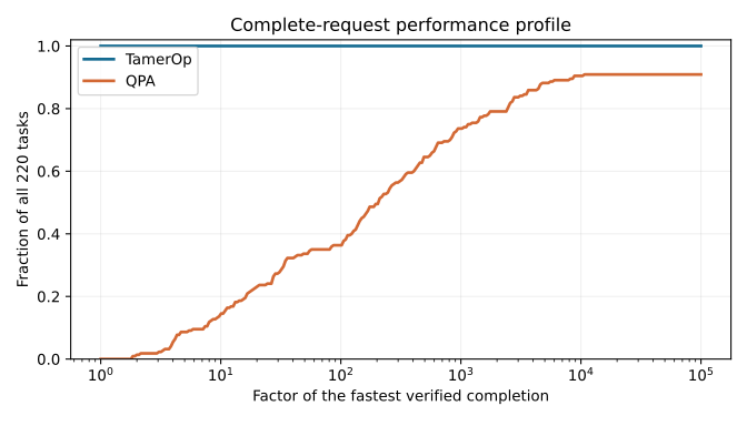
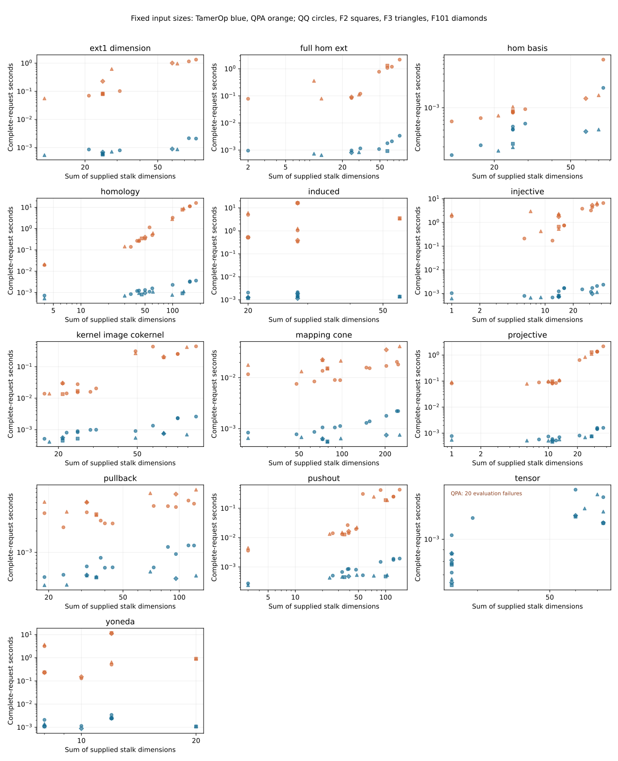
Keep this visual identity consistent across competitors. Adapt the plot type, panel count and section order to the mathematical question and available evidence. The benchmarking manual governs measurement, statistics and claims; styling never changes the population, weights, timing boundary or interpretation of a result.
Page rhythm and tables
Use a plain descriptive title such as “Finite-module algebra: TamerOp and QPA”. Open with a short quantitative account of the result, the compared population and the timing boundary. Give the reader a compact row of links to runtimes, machine details and downloads. Follow with the mathematical reason for the comparison and what was measured, then results by meaningful request or input family, actual times and sizes, and the relevant figures. Methods, machine specifications, memory and downloadable evidence complete the account. Combine or reorder these sections when the study needs it.
Keep the native documentation typography and ordinary Markdown tables. Use short connected paragraphs, descriptive headings, and bold only for the few numbers or qualifications that carry the conclusion. Avoid decorative cards, badges, colored winner tables and repeated headline numbers. The presentation guidance governs the wording of gains, similar performance and material losses.
Put the request or family first in tables, then input sizes and measurements. Keep TamerOp before the comparator in time columns and legends. Left-align labels and prose, right-align numeric columns, put units in headers, and use consistent rounding within a column. Display roughly three significant figures for comparisons; fixed decimal places are useful for a runtime table when they retain meaningful small values. Give full precision in downloads. Define medians, ranges and intervals before the table. A range across different inputs must look and read differently from a confidence interval. Use explicit missing-result text such as “No verified completion”, never a zero or an unexplained blank.
Shared figure settings
These settings reproduce QPA's visual character. Sizes are starting points at export size; check legibility at the width used on the page.
| Element | Default |
|---|---|
| TamerOp | Blue #156b91, always the first tool in the key |
| Comparator | Orange #d36935, labeled with the actual software name |
| Background and text | Opaque white figure and axes; black text |
| Typography | DejaVu Sans or a comparable plain sans serif; normal weight |
| Text sizes | 10 pt ticks, axis labels and legend; 12 pt panel titles; 11 pt shared heading/key |
| Axes | Thin black frame on all four sides, 0.8 pt; outward ticks |
| Grid | Major ticks only, gray #b0b0b0, opacity 0.20, width 0.8 pt; behind the data |
| Lines and points | 2 pt comparison lines; about 5 pt line markers; scatter area 22 pt² and opacity 0.65 when overlap matters |
| Supporting marks | Gray #788590 for individual ratio observations; #44505b for parity/reference lines; pale gray #eeeeee for a declared practical band |
| Export | SVG with an opaque white canvas; PNG when a raster copy is useful |
Supporting grays extend the QPA pair to other chart types; they do not create a second competitor palette. Keep tool identity independent of performance: the blue series is still TamerOp on a slower case. Additional tools need an explicit, consistent key rather than cycling the two colors and making them ambiguous. Color can be supplemented with solid/dashed lines, distinct markers or direct labels. Do not rely on color alone to identify a series.
For coefficient fields, retain QPA's circle/square/triangle/diamond convention for QQ/F₂/F₃/F₁₀₁ when those fields occur together. When shape already denotes field, use line style, direct labels or separate clearly titled tool panels for redundant tool identification; do not make shape mean two things in one figure. Keep semantic mappings stable across the report.
Prefer one shared key for a panel group, positioned outside the data, rather than repeating the same legend in every panel. A single plot can use a small legend in unused space. Titles identify the request or structural variant; the caption explains the conclusion. Use whitespace and alignment to separate panels. A 7 × 4 inch single plot matches QPA's profile; panel groups can use two or three columns when readable. Split a large sheet before shrinking labels to fit the page. QPA's full thirteen-panel sheet is not a required layout.
Match the plot to the evidence
| Reader's question | Preferred treatment |
|---|---|
| How much of the suite completes within a given relative time? | A performance profile with the shared tool colors, a labeled factor axis and a fraction axis from zero to one. State the full denominator and any weighting. |
| How does runtime vary across heterogeneous inputs? | QPA-style scatter panels, grouped by meaningful request; show actual sizes and times without joining unrelated cases. |
| How does one structural variant scale across measured sizes? | Connected points for that variant's ordered size ladder, with the same tool colors and a shared key. State that connecting lines guide the eye. |
| Which families favor either tool, and by how much? | A horizontal ratio plot: subdued individual points, blue aggregate markers with labeled uncertainty, a gray parity line, and an optional neutral practical band. |
| Where does the memory go? | A separate labeled memory figure or table. Distinguish process RSS, allocation traffic and retained objects; use the tool colors only for genuinely comparable measurements. |
PHAT's scaling and interval plots answer questions that QPA's scatter and profile do not. Keep those forms available within the shared style. For a ratio plot, label the direction explicitly as competitor time / TamerOp time; values above one favor TamerOp. Its aggregate marker represents a ratio, not a standalone TamerOp runtime. Explain this in the key. The practical band must be the one declared by the study, not a new threshold chosen for the plot.
Use logarithmic axes for multiplicative ratios or sizes/times spanning orders of magnitude when that helps interpretation. State the scale and units. Keep units consistent between companion plots and tables where practical; if one uses seconds and the other milliseconds, say so explicitly. Share axis limits between directly comparable panels when useful; visibly label different scales. Choose limits to show all relevant data and uncertainty. Do not copy QPA's numerical ranges or its 220-request denominator.
An empirical performance profile is a step function; render its actual jumps rather than smoothing them. Incomplete results remain incomplete coverage, not zero or infinite measured runtimes. Do not connect missing observations as though they were measured. A caption should identify the population, timing boundary, encodings and one fact to notice, with important limitations beside the figure. Supply useful alternative text and link the underlying data.
Reuse and review
Use report.mplstyle inside a Matplotlib style context so unrelated plots are unaffected. Resolve the path from the report generator's repository root. The preset supplies appearance; explicitly map tool names to colors and define scientific axes, markers and aggregation in the generator. Other plotting libraries should reproduce the same visual choices rather than being required to use Matplotlib.
Keep SVG labels as text when possible. This improves selection and inspection over QPA's original outlined lettering; check mathematical glyphs in the export. Preserve a white canvas in dark-mode pages so figure colors and text remain readable. Figure sizing, accessible series distinctions, explicit unit conversions and step profiles are refinements of the reference, not claims that every original QPA figure already follows them.
Before publishing, inspect the report at ordinary page width and on a narrow screen, including light and dark themes. Check label size, clipping, legend placement, alternative text, numeric table alignment and access to full-size figures. Compare each chart's values, bounds, missing cases and captions with the data. Keep tables or downloads available where a dense figure requires zooming. The first page should feel like the same report family as QPA without requiring readers to learn its particular subject beforehand.
An aesthetic revision re-renders existing measurements; it does not require new timing runs. Keep sealed measurement evidence intact. Publish revised figures with appropriate presentation provenance/checksums rather than silently overwriting an archived result set. A report may claim to use this style only after its actual exported figures have been reviewed.